Recreating Historical Graphics with ggplot2
Abstract
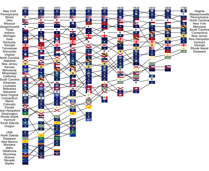
Talk given to the Iowa State University Statistical Graphics working group. There are some amazing data visualizations created at the turn of the 20th century to visualize the population of the United States. I recreate some with the R package ggplot2. Determining the sources of the data and finding historical data is also covered.
Date
Jan 31, 2018
Sam Tyner-Monroe, Ph.D.
Managing Director, Responsible AI
I am an applied statistician and data scientist, with a wide range of skills and experiences. I’m passionate about using data to make a difference.