Using the R Package geomnet: Visualizing Trans-Atlantic Slave Trade of Africans, 1514-1866
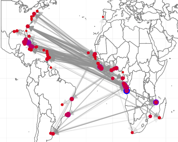 Figure 5. All slave trade ship voyages by U.S. ships. Size and color of points represent the number of slaves embarked and disembarked on each voyage.
Abstract
The Trans-Atlantic Slave Trade Database, hosted by Emory University, contains information on nearly 35,000 voyages of slave ships from 1514 - 1866 between Europe, Africa, and the Americas. The entire database contains 279 variables with information on the 34,948 voyages. While the website dedicated to this data contains a dashboard to subset and visualize the data, I wanted to view the data in a new way. I use the geomnet package because I wanted to show that the user can visually explore the data in a way that leaves them with a deeper understanding of the structure of the slave trade. I start by visualizing all of the data I pulled from the database on one map, then I look at different subsets of it, and I end with a much deeper understanding of the slave trade and its impact on the world.